Published in Whitelines Magazine Issue 95, February 2011
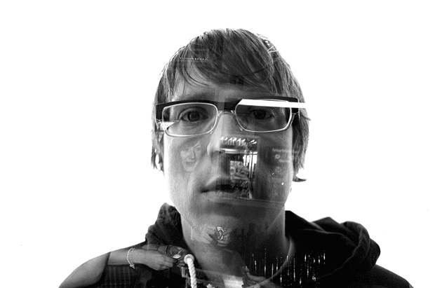
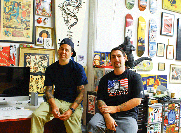
Erik Petersen is exactly the kind of dude you want to imagine designing your snowboard’s graphic. Born in Massachusetts, he grew up listening to punk rock and skateboarding. These twin passions quickly lead him into graffiti, as he explains: “My friends and I would go out bombing almost every weekend, just drawing and thinking about where we could go next to get these ideas on someone else’s wall. It seemed like a more creative way of acting out.” Playing drums in several bands, Erik crossed the US about six times on tour. He also got arrested “at least three times that I can remember”. He started out snowboarding as a way to fuel the stoke when snow stopped him from skating, and after taking art courses at uni, joined design agency JDK because he wanted to work on Burton graphics. Now 33 and slightly more settled with a cat and a kid, Erik is the design director for all of Forum’s graphics. We caught up with him to talk about his work on this year’s Youngblood.
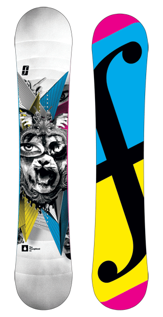
Where do the images that make up the Youngblood graphic come from? They look like photos cut from magazines.
They’re a combination of shots I took as well as pieces of photos from other sources – pretty much any imagery that we wouldn’t get sued for! We have to be very careful nowadays about making sure all the imagery that we intend to use for a collage such as this is not something that someone else holds dear.
Can you explain the process that went into making the graphic? It looks pretty layered and complex.
I printed the images out with a laser printer, mounted and cut them, then hung them with fishing wire. Many layers, but relatively low-fi and low-tech. I then shot the collages with a medium format digital camera.
Is there an advantage to that technique rather than just sticking the images on top of each other with glue or something?
I wasn’t stuck with any arrangement, so when I looked through the camera lens, if something wasn’t perfect I could deal with it easily. Plus, all the shadows and dimensionality is real and I could play with light and how the shadows cast on the different pieces making them dark and moody or bright and poppy; if I had glued things it would have just felt flat.
“I’ve been arrested at least three times that I can remember”
Do you often work with collages?
I have always appreciated collage for its ability to convey meaning through imagery or typography that was meant to communicate something else entirely. Re-contextualizing things has always interested me.
What about the bits around the central collage – how did they come about?
I shot those and added them in afterwards. I wanted to put some forms in there that created some energy, some outward motion and sharpness. It’s a little bit of trial and error, a little bit of knowing what will get you where you want to go, and a little bit of going with your gut.
Who or what were the inspirations behind this board graphic? Did you feel like you were trying to say anything in particular?
This board is mainly a reaction to the moment and the audience. Our aim was to convey the idea of aggressive creativity, which is something that the riders do every time they ride. Their art form is not a passive one it’s hyper-active, and almost violent.
With this board, does the fact that the image is part of a practical functioning product change its meaning at all?
Context counts. The things the kids do with these boards give the graphics meaning and purpose. Seeing a base fly through the air or hit a rail is a huge part of a graphic’s definition. Without that, a snowboard is just an oddly shaped canvas.
Did you look at the other boards in Forum’s range or previous boards or do you deliberately not look at what came before?
We have to be hyper-aware of what’s happened in the past. Usually that information tells you what NOT to do, but sometimes you can find inspiration.
Check out a video of Erik working on the Youngblood graphic at whitelines.com/youngblood-graphic, and see more of his work at behance.net/erik_petersen.


