Published in Whitelines Magazine Issue 92, November 2010
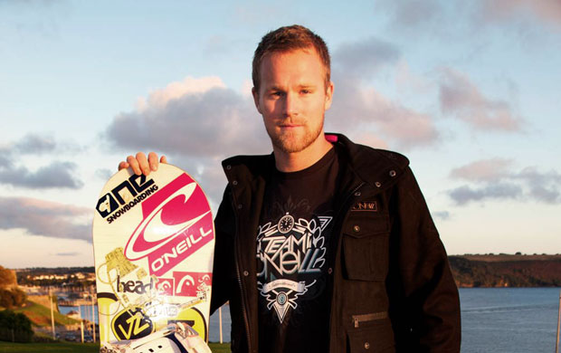
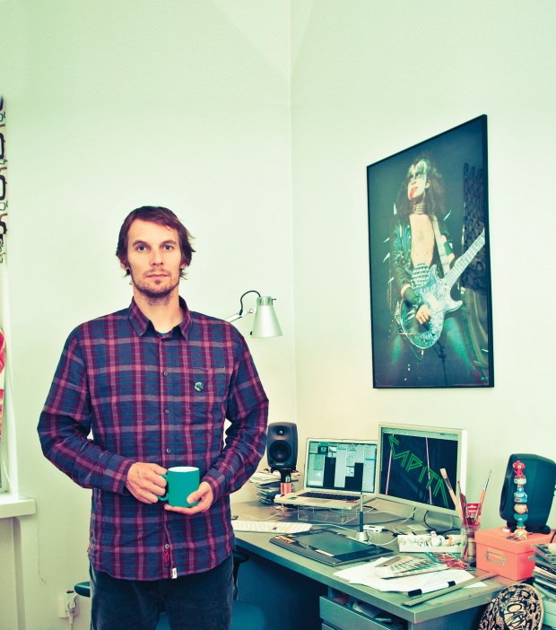
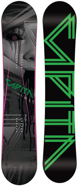
Jari Salo is a self-confessed snowboarding obsessive who also happens to be an incredible artist. Luckily for him, he’s managed to combine these two passions and somehow make a living out of it. Which is just as well, because as Jari himself admits, there aren’t that many obvious career options when you’re “a hyperactive kid who couldn’t focus on anything other than drawing spaceships, skating and going snowboarding!” His break came when one of his good friends, the legendary Finnish pro Joni Mäkinen was offered a pro model by Joyride Snowboards and asked Jari to design his graphic. Since then he’s been commissioned by Burton and Head, designed several boards for Jussi Oksanen, and done the graphics for most of Mäkinen’s long-running series of pro-models with Option – inventing first the swords and then the ‘three trees’ graphics that made them so iconic. More recently, he’s started working for Capita, designing the dark, disturbing graphic on this year’s Quiver Killer.
All your graphics look really different – do you get inspired by different things each time?
Yeah, I get stoked if I’m able to make something new and fresh that I have never done or seen before. My approach is to try to find a different solution to each individual design case rather than repeat the same style everywhere.
How did you start working for Capita?
I’ve always been a big fan of Capita. I think they have great conceptual thinking in all their designs. I felt that I could do something different from the designs I had done before for other companies. So I contacted Blue from Capita and asked if I could work for them and luckily he said yes.
What’s the idea behind the Quiver Killer graphic?
It’s about unknown powers and witchcraft.
Ah that’s perfect for our Halloween issue! Do the geometric lines and girl represent anything? Or are they just there because they look cool?
I wanted to achieve something that’s not too obvious with that face and that ‘occult’ space-style geometry. Also I wanted to leave the black matter that’s coming out of her mouth open to question…
So what actually is that black stuff coming out of her mouth?
It’s black matter [laughs]. Not puke…
The girl is originally from a photo right? Who is she? Where did the photo come from originally?
The face is from some 50’s fashion magazine. It’s a tight crop of a bigger picture. I modified the eye with a mask.
The font on the base looks quite 80’s-inspired. Was that a conscious decision or did you just like that font?
Capita has this space theme going on right now so I made the logo like an 80’s space style.
Did you come up with everything, or did Capita give you strict guidelines?
The Capita guys definitely know what direction they want to take their designs. Usually they send me some rough ideas and mood pictures before I start to work on designs. I like to work with proper briefs because then I know the direction better and there’s not so much trial and error with the final piece.
Finally, can you see any overall trends in snowboard graphics? What do you expect to see from board graphics in the future?
In my opinion there’s still a strong trend going on with the messy, distressed, skate influenced ‘punk’ style. In the future, I have a nasty feeling that some companies, especially the bigger ones, are going to produce more safe, easy-to-swallow graphics that are less experimental in order to please bigger audiences. Let’s hope like hell that I’m wrong!
Check out more of Jari’s work, including his classic board graphics at Jarisalo.com

