Published in Whitelines Magazine Issue 96, March 2011

As well as having a great name, the two artists that make up Morning Breath have pretty great job. Jason Noto and Doug Cunningham grew up on opposite sides of the US, but met in San Francisco in 1996, where they were both working for Think Skateboards. Finding they worked well together, the pair of them decided to found their own company in 2002. Since then, they’ve become the go-to men for album covers for a whole host of A-list acts. To date, they’ve done artwork for Queens of the Stone Age, the Foo Fighters, De La Soul, Placebo, Slayer and TV on the Radio to name just a few. Not bad for two kids who list their early influences as “sniffing glue, punk rock, racking paint and hip hop!” Somehow they’ve also found time to work on their own projects, keep designing skateboards (notably for Zoo York) and venture into snowboard design. Despite not snowboarding themselves, these Brooklyn-based artists like board design because “there’s more space to have fun. Most rock groups, even the super-cool ones, are very particular about their image”. Salomon, on the other hand, gave them a pretty free rein with their Sanchez board. We caught up with them to chat about what they made of it.
How did you get into doing snowboard graphics? Was this the first board graphic you’ve done?
We did some work for Burton a few years back, but don’t think it went into final production. Most of the work we’ve been doing for the past couple years has been with Ride Snowboards.
Can you explain a bit about how your collaborative process works? Do you do every project together?
We both contribute at least opinions and input into just about every project, but we each have our specialties that we bring to the table. Jason handles more of the graphic design typography, while Doug’s angle is the illustration.
“Just cause we have beers in our hands does not mean we aren’t working!”
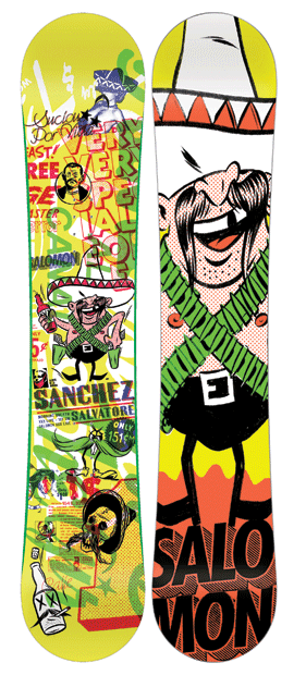
What’s the process that goes into creating a piece like the Dirty Sanchez graphic?
The Dirty Sanchez was a multi-layered collage. We start with a solid amount of assets. So illustrations, found typography, and photos. We just start building and composing until we’re satisfied.
Where do the images and the fonts that make up the collage come from?
We create many of the images ourselves, and we have a process to distress them, or break them down to make them look a bit more raw. We mix these with odds and ends of images found from various vintage sources, and merge them so they feel like they are from the same frame of reference.
What are the inspirations behind your work?
In no particular order- missing teeth, false teeth, typography, smoking, vintage pornography and generally anti-social elements! Actually, the biggest influences on our work are the unknown designers and illustrators who designed all those quirky little ads that you find in the back of vintage magazines. Many of them were for some sort of scam or get-rich-quick scheme. With this board we wanted to pay homage to the kind of crude printing they used, and capture that lo-fi aesthetic.
You’ve worked for some pretty big clients in the past, bands like the Foo Fighters, and Them Crooked Vultures – do you get to hang out with them? Or do you mostly deal with record labels?
With most bands we work for we deal mostly with the record label, and the management. On occasion we hang out with the bands, but it’s still more work-related than strictly social. Just cause we have beers in our hands does not mean we are not working!
With the Dirty Sanchez, did you look at the other boards in their range or previous boards? Or do you deliberately not look at what came before?
We usually don’t. I think it’s out of laziness. It’s easier for us to just jump in head first, and not concern ourselves with what has been done before.
Finally, can you see any overall trends in snowboard graphics? What do you expect to see from board graphics (yours or other people’s) in the future?
I feel the trend right know is still very texture and layer-based, not so focused on any central image. Very chaotic basically. We’d like to see more bold and iconic images. But hey, that’s just us!


